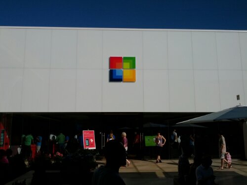
After 25 years of the same old Microsoft logo, a new squarer logo is revealed. Basically four different colored squares arranged in a, umm, square. Pretty innovative, right? That’s what I thought. It’s pretty much the same logo that’s been appearing on Microsoft’s newly opened brick and mortar stores as Mr. Softy tries to compete with Apple. It’s just newly simplified with just the four color squares and no other color gradients as in the photo below.

- Microsoft Store at Stanford Mall, Palo Alto, CA
The same logo appears on their online store pages along with the new four color logo.![]()
Microsoft is trying to push a new image ahead of their Windows 8 upgrade later in the year. These new colorful squares are sure to build excitement in new Microsoft products.